
This topic explains how to manually create a Column, Column stacked, Area, Area stacked, or Line chart using NextGen Geo.
Before you start
Configure the first step of a dashboard module: Select service
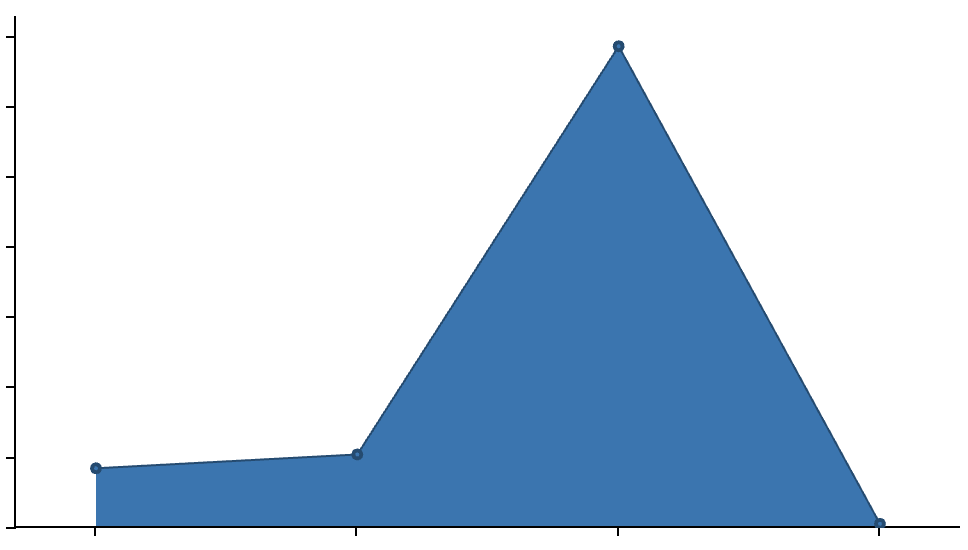
Configure a Column / Area / Line chart
The selected service can be filtered using the “Add main filter for the statistic” section, where additional conditions can be applied to various service fields using AND or OR logic.
Next, the “Define the statistic configuration” section allows you to specify which statistics to apply to the service fields.
-
COUNT: Grouping values, only integer fields (see COUNT example)
-
“How many solar panels of each type?”
-
-
SUM: Summing values. only integer fields (see SUM example)
-
“How much energy produced for each geographic area or zone?”
-
-
AVG: Calculating the average of values. (The example is the same of SUM example but changing the statistics)
-
“What is the average production of each solar panel?”
-
-
MIN: Finding the minimum value. (The example is the same of SUM example but changing the statistics)
-
“What is the lowest energy production of any solar panel?”
-
-
MAX: Finding the maximum value. (The example is the same of SUM example but changing the statistics)
-
“What is the highest energy production of any solar panel?”
-
The “Define the chart configuration” section allows you to select fields to use for Axis X and Axis Y and their labels.
The “Define the series for the statistic” section allows you to select a field to use as the series.
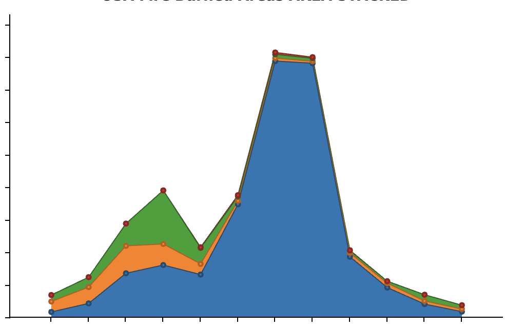
If you want a column stacked dashboard, you can add more series and the result will be grouped by two fields.
Set flag “Filter by user extent” to true to make the charts dynamic when interacting with the map.
Example
A company managing a network of solar panels distributed across various geographic areas. The goal is to gather statistical data on the panels, such as their location, type of installation, and energy production performance.
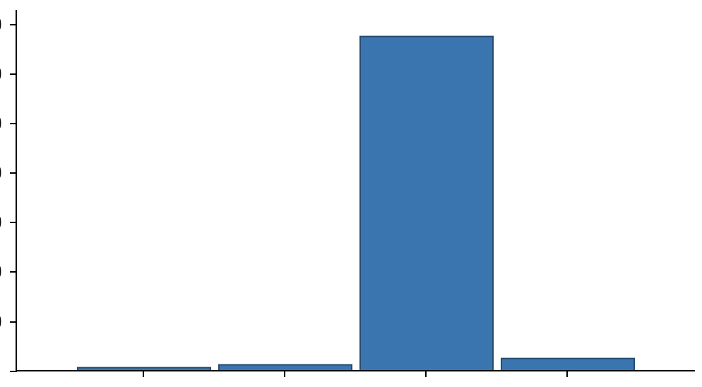
COUNT Statistics - Number of Solar Panels by Type
Goal: Visualize the number of solar panels by type (residential, commercial, industrial).
Pre-condition: the service has a field “Type” with the information of solar panels type
Steps to do:
-
Select COUNT as statistics
-
Select “Type” as Field
-
Select “Type” as Axis X
-
Axis Y is automatically filled by the system with “COUNT value”
-
Set label x and label y
-
Series is automatically filled by the system with “Type”
-
If you want a column/area stacked dashboard, you can add another field as serie and the result will be grouped by two fields.
-
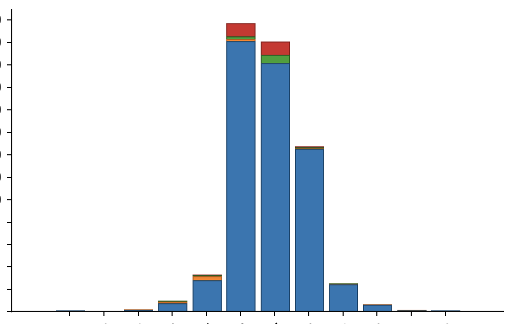
SUM Statistics - Total Energy Production by Area
Goal: Visualize the total energy production for each geographic area or zone.
Pre-condition: the service has a field “Area” to identify covered areas, and “Energy production” for each solar panel
Steps to do:
-
Select SUM as statistics
-
Select “Energy production” as Field
-
Select “Area” as Axis X
-
Axis Y is automatically filled by the system with “Energy production”
-
Set label x and label y
-
Select “Area” as Series
-
If you want a column/area stacked dashboard, you can add two series and the result will be grouped by two fields.
-
Reference:
-
Access to dashboard widget: Module widget
-
Configure user’s access to module widget: Functional Groups